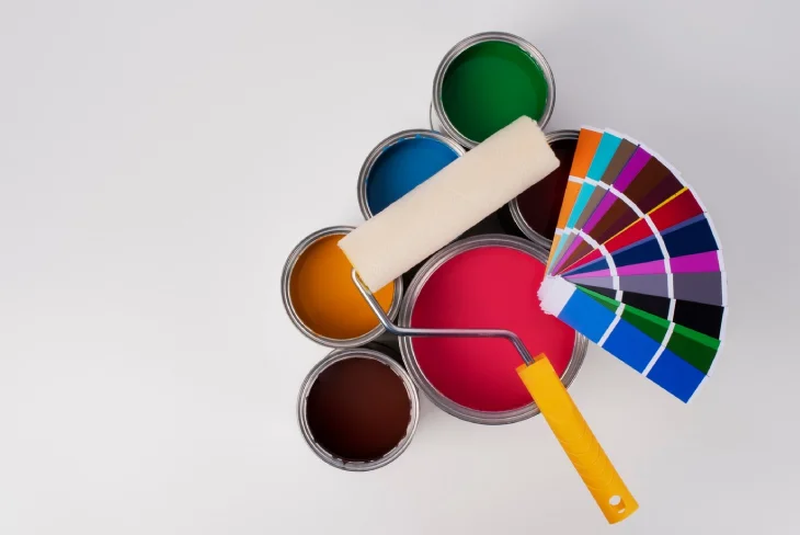
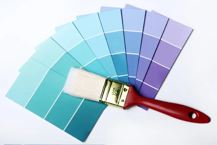
The world of wall paints is brimming with exciting options for those planning a renovation in 2025. Many leading brands have unveiled their Colours of the Year, surprising us with their inspiring choices.
In this article, we’ll take a closer look at the trending shades that deserve your attention as you refresh your walls for the upcoming season. Enjoy the read!
Cinnamon Slate
Cinnamon Slate by Benjamin Moore is a warm, neutral shade that effortlessly blends soft plum and velvety brown tones. Its subtle yet inviting character makes it ideal for creating a cozy and sophisticated atmosphere. Whether you’re planning a property refurbishment for your living room or bedroom, this color promises to add a touch of elegance. Pair Cinnamon Slate with muted greys or creamy whites for a balanced, modern palette. If you want a bolder statement, consider combining it with deep greens or metallic accents in copper or brass. Soft furnishings like plush rugs and velvet cushions can enhance its luxurious feel, making your space both stylish and welcoming.
Caramelized
Dunn-Edwards Caramelized offers a warm terracotta brown with earthy undertones reminiscent of sunbaked clay. This shade is perfect for kitchens and dining rooms, where its natural warmth creates a comfortable and inviting environment. Pair it with warm neutrals, such as beige or off-white, for a subtle look, or add contrast with cool blues or forest greens for a dynamic yet harmonious feel. Terracotta pots, woven baskets, and natural wood furniture are excellent additions to complement Caramelized’s rustic charm.
Quietude
Sherwin-Williams presents Quietude, a blue-green hue with a stronger green undertone. This calming soft sage with a hint of blue influence is an excellent choice for bedrooms, bathrooms, or any space where relaxation is the goal. Quietude pairs beautifully with natural materials like light oak or rattan. For a cohesive design, integrate neutral fabrics and green indoor plants. If you’re planning construction solutions in North West London, Quietude can help you to seamlessly blend modern and natural aesthetics, making it a timeless choice for homes in this historical part of the city.
Encore
Valspar’s Encore is a deep, striking blue that commands attention. This dramatic color is perfect for creating statement walls in living rooms, home offices, or even entryways. Its rich tone exudes sophistication and is well-suited to spaces with ample natural light. For a balanced palette, pair Encore with soft neutrals like light grey or cream. Metallic accents in gold or silver can amplify its elegance, while bold patterns in cushions or curtains can add a playful twist. Dark wood furniture also complements the depth of Encore beautifully, enhancing its timeless appeal.
Truffle
Stainmaster’s Truffle is a restorative chocolate brown that adds depth and warmth to any room. Its grounding presence makes it perfect for cozy living spaces, dining rooms, or even libraries. Truffle works well with lighter shades like beige or taupe for a monochromatic look, or you can add contrast with vibrant tones such as mustard yellow and teal. Incorporate soft textures like wool throws, leather chairs, or jute rugs to elevate its comforting essence.
Purple Basil
Glidden’s Purple Basil is a dark, dusty violet with a hint of mauve undertone—a refined and unique choice. Its neutral yet moody vibe works wonderfully in formal spaces like dining rooms or elegant bedrooms. Pair Purple Basil with greys or muted pinks for a sophisticated look, or add touches of diamonds or glass elements to create a luxurious sparkle. Velvet curtains, silk cushions, and antique gold decor can enhance its regal feel while keeping the atmosphere inviting.
Elderton
Graham and Brown’s Elderton is a perfect neutral brown inspired by the earthy tones of elderberry leaves. This versatile color is ideal for hallways, living rooms, or any space where you want a subtle yet warm backdrop. To complement Elderton, consider pairing it with pale greens or creamy whites. Adding textures like woven rugs and linen drapes will further enhance its organic appeal. Elderton’s natural tone makes it a timeless choice for homes that embrace understated elegance.
True Joy
No roundup of 2025 trends would be complete without a nod to Dulux’s True Joy. This uplifting yellow brightens any space with its vibrant energy. Perfect for kitchens, playrooms, or sun-drenched living areas, True Joy injects optimism into your home. Pair it with soft greys or whites for a modern look, or combine it with deep blues or emerald greens for a striking contrast. Whether you’re planning a mansard loft conversion or refreshing an existing space, this cheerful hue adds a lively, welcoming touch.

Conclusion
So, there you have it! The world of paints in 2025 is bursting with exciting wall colors. From the warm and cozy Cinnamon Slate to the cheerful True Joy, there’s a shade for every taste and mood. These colors aren’t just about looking pretty – they can change how a room feels. Whether you want your space to be calm and relaxing or bold and energetic, there’s a color trend that’ll do the trick.
As you think about sprucing up your walls, remember that these colors are more than just trends. They’re a chance to express yourself and make your home feel like, well, home. Don’t be afraid to mix and match or try something new. After all, your walls are like a big canvas, and you’re the artist!
So go ahead, pick a color (or two) that speaks to you, and start painting your way to a fresh, fabulous space for 2025.

